Landing Pages That Convert: A Guide for Small Businesses
A landing page with a 5% conversion rate and one with 1%: same traffic volume, five times more leads. The difference is rarely the design budget. It is the structure and the copywriting.
This guide shows the anatomy of a high-converting landing page, the structures that work for service-based small businesses and the mistakes that kill conversion even when everything looks beautiful.
What a Landing Page Is
A landing page is a page created with a single goal: to turn the visitor into one specific action, such as filling in a form, clicking a WhatsApp button or making a purchase. Unlike a normal page on the site, it has no full navigation menu and no links that distract the visitor from the goal.
A good landing page answers three questions in the first 5 seconds: "What is this?", "Who is it for?" and "What do I do now?"
Anatomy of a High-Converting Landing Page
A Powerful Headline
The headline is the most important element. It must be clear, specific and benefit-oriented, not feature-oriented. Compare:
- Weak: "We offer quality services for your business"
- Strong: "A new website you can preview before you pay the balance, with no surprises"
The second version says what you get, how fast and what the benefit is for the client.
Subheadline
It expands the headline with extra context: who you are, who it is for, what sets you apart. Two lines at most.
Hero Image or Video
It shows the product or service in use, or the result achieved. Avoid generic stock photos of handshakes. Prefer real screenshots, a photo of the professional or a mockup of the service.
Benefits (Not Features)
The visitor does not care that you use "cutting-edge technology". They want to know what they gain. List 3 to 5 concrete benefits:
- Get a site that loads in under 2 seconds on a phone
- Receive enquiries directly on WhatsApp, with no forms in the way
- Update your own content without calling a developer
Social Proof
Testimonials with a name and photo, client logos, the number of projects delivered, concrete results ("cut report time by 80%"). Social proof reduces perceived risk. It is validation that what you promise really happens.
A Clear, Repeated CTA
The call-to-action button must be visible above the fold (without scrolling) and repeated at the end of the page. Use active, specific language: "Request a Free Quote" instead of "Submit".
The button must contrast visually with the background. If the background is white and the button is also pale, nobody will click.
A Simple Form
Every extra field in a form lowers the conversion rate. For a first contact, name + email + phone is enough. The other details can wait for the next conversation.
5 Structures That Work for Service-Based Small Businesses
- Problem, Solution, CTA: presents the client's pain, shows how you solve it and invites action
- Before, After, CTA: shows the current (frustrating) state and the desired state (after the service)
- Benefits, Social Proof, CTA: for clients who already know what they want and need validation
- Question, Answer, CTA: starts with the doubt the visitor has in their head
- Case Study, Results, CTA: for B2B services where proof of results is the main trigger
Mistakes That Kill Conversion
- Several competing CTAs: "Learn more", "Contact us", "See the portfolio". What is this page's goal?
- Too much text above the fold: the visitor needs to see the main benefit and the CTA without scrolling
- No social proof: without testimonials or results, perceived risk is high
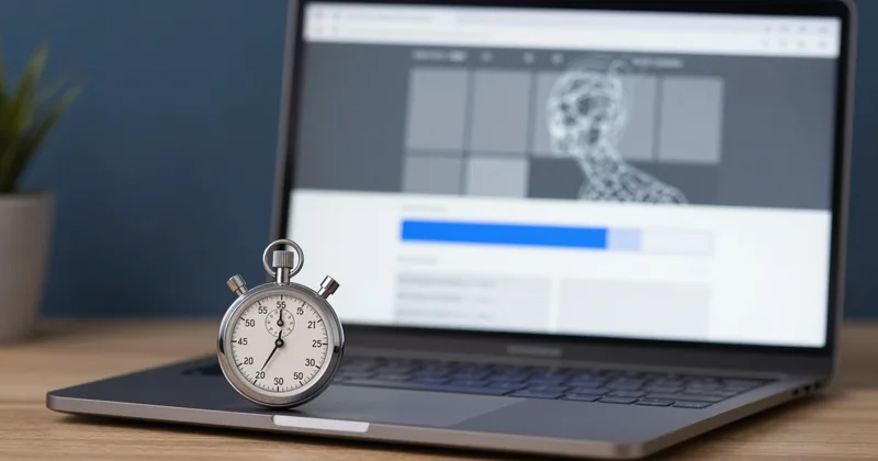
- Slow loading: every extra second costs conversions, and a landing page should load in under 2 seconds
- Low-contrast CTA button: if the button does not stand out visually, it does not get clicked
How to Measure Results
Set up conversions in Google Analytics 4 to record every form submission or WhatsApp click. Use Hotjar (free version) to see heatmaps: where visitors click and how far they scroll. With that data you can test variations of the headline or the CTA and measure which converts better.
My custom websites include landing pages optimised for conversion. See examples in the portfolio and, to discuss your own landing page, get in touch through the form or WhatsApp.
Want to know how your website is doing?
Ask for a free review: within 48 hours you get an analysis of your website and of what shows up on Google for your service.